BAGIC-Insurance Portal
Redesign of 20+ B2B2C enterprise partner portals across 11 Lines of Business in a multimillion dollar large digital transformation program for India’s leading general insurance provider company.


Travel Insurance
Home Insurance
Motor Insurance
Health Insurance
Overview
OBJECTIVE:
To deliver unified and consistent user experience across all enterprise SaaS portals used by client's partners - Insurance Agents, Corporate Tie-ups, Executive Tie-ups and National tie-ups.
The goal was to deliver intuitive responsive web portals that can help partners support their day-to-day functions efficiently and quickly. Thus, helping them to gain more business through an increased volume of policy issuance/servicing per day.
EXECUTION:
Design Research
Competitor Analysis
Qualitative Research
Heuristic Reviews
Information Architecture
Strategy
Process Modelling
Workshop Facilitation
Prototyping
User Testing
Final Mockups
Visual Design
ROLE AND TEAM:
1 X Lead UX Designer
1 X Senior UX Researcher (My role)
2 X UX
1 X Senior UI
1 X UI
4 X Graduate UX/UI
DURATION:
8 months
Challenge
-
Devise the road map and overall design strategy for the digital transformation.
-
Help the client establish design-led business objectives
-
Build, lead and execute and setup the design research-led approach
-
Limited access to the end users
Double Diamond
DesignApproach
Understanding as is
Design strategy
Execution

Discover
Understanding: 'As-Is' model

INSIGHTS
-
Corporate Branding of the public website to be followed
-
For new product configuration, approval from IRDAI is required which is the Insurance governing body in India
-
The client offers insurance in 11 Lines of Business (LOBs)
-
26 out of 47 enterprise portals/websites in scope
-
85% of business comes from Travel, Health and Motor LOBs
-
The transformation had to kick-start with Travel LOB
-
Two Travel portals - Agents, Corporate
-
2 types of business transactions can be done through portals
-
Policy Issuance
-
Policy Servicing
-
-
4 types of Policy Servicing
-
Endorsement
-
Cancellation
-
Renewals
-
Claims
-
StakeholderMapping

Vision 'To Be'
Objective - To identify
1. Business Objectives
2. Competitors
3. Design Inspirations
4. Targeted Screen Resolutions
Technique -
Co-discovery workshop
Stakeholders -
1. Business - Head of Department(HOD), Travel LOB
2. Client IT - Head of Digital, Program Manager
3. TCS - Solution Architect, Lead Business Analysts
Vision
-
Currently second best after TATA AIG in Travel LOB, wants to better them
-
Policy issuance to be completed in ~45 seconds
-
Single page issuance is expected
-
Benchmark for digital experience is TATA AIG
-
Fully responsive website

UXDesign
Heuristic Analysis
Qualitative Research
Thematic Analysis
Competitor Analysis
Persona
User Journey Map
Task Flows
Information Architecture
Prototyping
Wire-framing
User Testing
Visual Design
HeuristicEvaluation

Objective -
To evaluate usability of the existing portals
Technique -
Neilson Norman usability principles
Sample size -
10 UX professionals
INSIGHTS
-
Too many input fields
-
Poor error handling
-
Jumbled flow of information
-
Inconsistent design language
-
Inadequate and unintelligent global search
-
No session storage
-
Pre-population missing
-
All plans in single drop-down!
QualitativeResearch
STAKEHOLDER WORKSHOPS
Target group:
1. Business Users
2. SMEs - Sales, Underwriting
Objective - To understand
1. Context of use
2. Challenges with the existing processes
3. Technical hindrances
4. Expectations from To-be
CONTEXTUAL INQUIRY & USER INTERVIEWS
User group:
1. Primary Users - Agents (n=9)
2. Secondary Users - Back-office (n=2)
Objective:
To understand users' goals, needs, challenges and expectations when using the Agents portal for their day-to-day activities
Method:
1. Paper-based questionnaire, followed by
2. Semi-structured interview
ThematicAnalysis
Data collected through User Interviews and Contextual Inquiry were coded in bottom-up approach
Emerged patterns and co-relation between them led to theme generation


-
Lack of Awareness on plans
-
Over-reliance on Back-office for non-STP processes
-
Application inefficiency
-
Inadequate support mediums
-
Lack of flexibility
-
Lack of trust between the client and Agents
CompetitorAnalysis

INSIGHTS:
-
TATA AIG have better products and features- coverage for PED, Senior Citizens
-
Religare gives best experience
-
Non-intuitive interface has led agencies to create own interface using client's APIs
Define
AgentPersona


UserJourneyMap

INSIGHTS
-
Manual processes for non-STP(straight through process) policy issuance impacts conversion
-
Back-office operations are overwhelmed with requests
-
Dependencies on others leave the user in constant state of anxiety until policy is issued
-
Overall high cognitive load throughout the process
KeyInsights
INSIGHTS:
-
Submission of proposal form causes dropouts, impacts business
-
~180 plans in single dropdown - Age, Geographical Cover, Sum insured and type of policy
-
Application inefficiency
-
Policy non-issuance despite of fund availability
-
Quote sharing using screenshots
-
Outdated products
-
Discoverability
-
Average Issuance 4-5 mins
-
Session time-outs
-
-
Dependency on back-office
-
Assistance for non-STP, underwriter approvals, slow response
-
Financial amendments
-
-
Support mediums/channels
-
Outdated brochures
-
Lack of knowledge in back-office
-
-
Flexibility - can’t issue policy on-the-go
-
Daily mailer notifies pending actions
-
Preview not available before submission
-
Multiple Party IDs for existing customers create overhead of due diligence
VALIDATIONS:
-
Lack of awareness of types of plans, agents tend to sell the same plans because of discoverability issues and lack of training
-
85-90% desktop users
-
The policy should be issued in ~60 secs
-
Trust issues are developed because of incompetent technology
-
Daily mailer notifies pending actions, but it's difficult to keep track of them resulting in loss in renewals which impacts business
-
Religare not Tata AIG gives the best Digital experience, TATA AIG has more features
UserNeeds

IdentifiedDesignSolutions
-
Minimise cognitive load
1.1 Minimise number of fields
1.2 Maximise discoverability of important functions
1.3 Better error handling and labelling
1.4 Logical grouping and consistent flow of information -
Automation of manual processes
-
Minimise mistrust caused by less efficient communication channels
-
Digital experience of Religare for inspiration
-
Policy Issuance in ~60 sec
-
Responsive web-design with desktop-first
TaskFlows

InformationArchitecture
Hierarchical IA based on finalised task flows and paper prototypes

Design
RapidPrototyping
ITERATION 1 - DESIGN CRITIQUE
I deployed the practice of design critiquing involving all team members to ensure ideas proposed follow the best practices of user-centric design.
ITERATION 2 - DESIGN WORKSHOP
Stakeholders - Design,Business and Technical teams
Objective - To identify viability and feasibility of proposed ideas
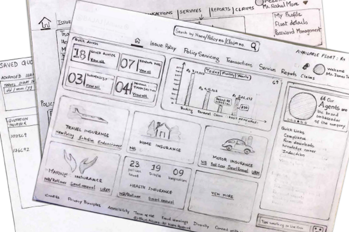
InteractiveWireframes
Based on finalised paper prototypes, Interactive wireframes were created on Axure.

UserTesting
Objective:
To evaluate designs with the end users
Method:
Think-aloud moderated Usability Evaluation
Execution:
Agents were asked to complete a scenario-based task on interactive wireframes. While performing tasks users were:
1. asked to think-aloud their actions and the motive behind them
2. observed to understand if they are actually doing what they are saying
3. asked to fill exit usability questionnaire
UI Design
Visual Language Identification
Theming and Branding
Screen Design
Visual Language Identification
Stakeholders -
Head of Digital, Digital Marketing and Corporate Branding Team
Branding questionnaire - To find out
1. Visual design goals
2. Vision for new interfaces
3. Permitted use of Logo, Colour, Imagery and Fonts
Co-discovery workshop -
To establish synergy between the Stakeholders for Visual Language based on their inputs from Branding Questionnaire
INSIGHTS
-
Conversational tone
-
Minimalistic design approach
-
Stock images to be avoided
-
Illustrations, wherever possible
-
Maximise use of primary colour (blue)
-
Orange to be used as accent colour
-
User Interface of Digit emerged as the benchmark
Theming&Branding
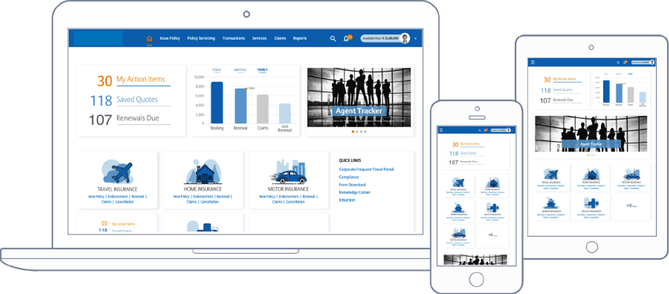
Based on insights from Visual Language Identification three UI design options for a home page and a form page were created and demonstrated to stakeholders. Below is the design option we worked on along with two team members
ScreenDesign
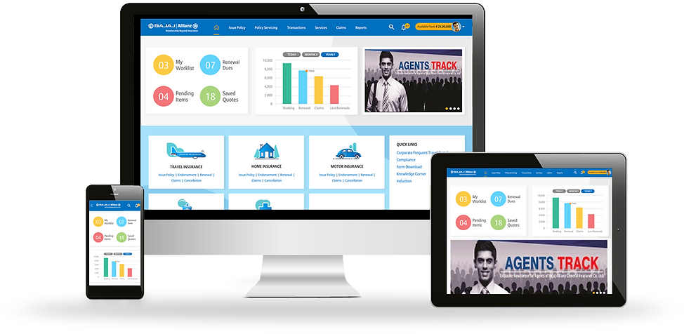
Based on feedback on selected designs Visual Language, Theming and Branding were finalised. Below is the final design for the dashboard
Impact&Outcome
-
Automation of the manual process of proposal form by replacing it with transcripts
-
Simplified flow with consistent design language
-
Mandatory fields down from 54 to 37
-
Reduced transaction time by 200%
-
Increased agent’s online presence by 350%
-
New business through delivery excellence
-
Upskilling and growth of team members
NextSteps
-
Digitisation of Branch Office Customer Information Sheet
-
Updated brochure
-
Invest in robust communication channels like AI chatbots and dedicated contact centres to establish transparency and empower agents
-
Send quote via WhatsApp
-
New product configurations for evolving needs - Seniors, PED
-
Trainings for new plans and amendments